
 |
| credit https://c1.staticflickr.com/9/8075/8448339735_e6626c28ff_b.jpg |
I wrote this blog a couple of months before everyone started decrying the proliferation of fake news. Notice just about every fake news piece is accompanied by some sort of visualization, whether it is a graph or photo or video. They all capitalize on the "seeing is believing" concept, and one has to be extra vigilant about the lure of visual evidence.
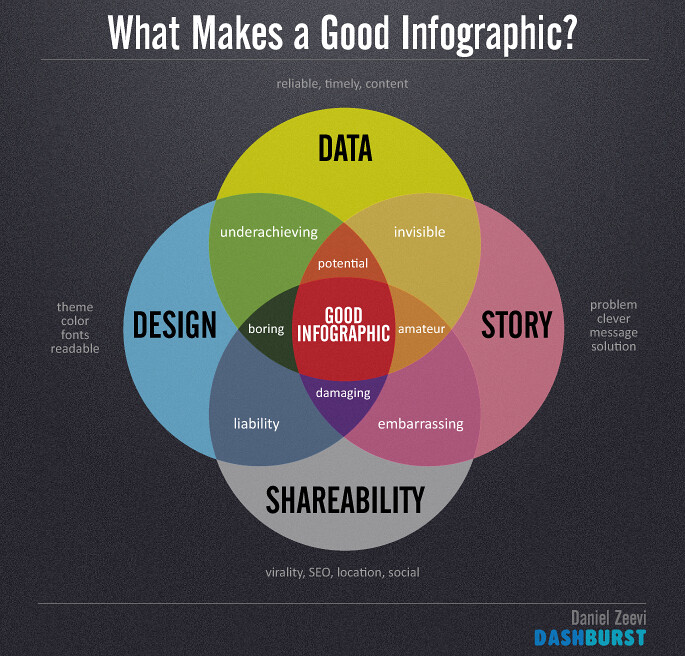
As a regular big data blogger for several years now, I’ve noticed that in the last couple of years, data visualization has become a major focal point. The old maxim of “Seeing is believing” is the real driving force behind visualizations of data. While not all of us relate to spreadsheets, we tend to respond well to graphs, charts, and other visually appealing renderings of those numbers.
As a regular big data blogger for several years now, I’ve noticed that in the last couple of years, data visualization has become a major focal point. The old maxim of “Seeing is believing” is the real driving force behind visualizations of data. While not all of us relate to spreadsheets, we tend to respond well to graphs, charts, and other visually appealing renderings of those numbers.
As
Brian Gentile, Senior VP and General Manager, TIBCO Analytics Product Group,
TIBCO Software, wrote here there are
business benefits to data visualizations.
They include making it easier to take in information, manipulating, data
in various ways, and showing relationships.
On the latter, Gentile observes, that “finding these correlations among the
data has never been more important.”
Indeed,
the demand for that kind of instant insight that data visualizations can
deliver is what drove Google to build its own data visualization product
(currently in beta) called Data Studio. I saw a presentation of the features, including a report on the effectiveness of Olympics ads. It was that particular
visualization that made me think of the danger inherent in relying completely
on the story presented graphically.
In
that analysis of the effects of ads on consumers, the report stresses that it
asked people who saw the ads of particular brands what effect it had on their
perception of them. Of course, the graphs are what grab your attention and that
show that that 34.9% of viewers recall seeing the Coke ad. The graph does not
show what the text admits that overall “only about 8% of viewers can recall
both the brand and product in a specific advertisement.” So the graph here
implies a much more positive effect for ad recall than the overall data
actually shows.
The next bar graph shows you that “Consumers
who saw the ads were 18% more positive about the brand and were 16% more likely
to find out more or purchase the product in the ad.” These are fairly modest
numbers that don’t necessarily promise much bang for sponsor bucks. So this is
followed by a third graph with the title “Which ads showed the greatest
response?” That shows really impressive numbers ranging from 112%- 142% for
the top 3 brands.
A
mere glance would make you think that these show amazing results for the
marketing efforts. Then when you read a bit, you realize that they merely
reflect the increase in search. In other
words, the graph does not show that the McDonald’s commercial resulted in an
increase of 42% in sales, merely an increase of that amount in online search
that includes the brand. Still, you may say that is a positive metric that
could possibly translate into improved sales down the road. But the chain of
causation here is missing a few links.
I got
to speak to the Google people about Data Studio and asked if they had even
determined if the people who were doing the search were the ones who had seen
the ads as was the case for the first two graphical presentations. They had
not. True, it doesn’t say that the graph
refers to the people who had seen the ads, but the context would make the
viewer think that it does, and not everyone would even think to ask annoying
questions like I do.
Ultimately,
what makes data visualization so effective at conveying a point is that they
don’t require much analysis on the viewer’s end because they’ve already done
that kind of thinking for you. That’s both seductive and potentially
misleading.
That’s
exactly why we have to be careful about not merely accepting the visually
expressed story at face value. Any data visualization should be subjected to a
triple C test.
Read about it here.
Also check out http://www.clickhole.com/article/greatest-all-time-statistical-portrait-babe-ruth-3983
The one on the Babe versus the #12 may be my favorite example of the abuse of data visualization, and I'm not even a sports fan
Also check out http://www.clickhole.com/article/greatest-all-time-statistical-portrait-babe-ruth-3983
The one on the Babe versus the #12 may be my favorite example of the abuse of data visualization, and I'm not even a sports fan
Related post:


No comments:
Post a Comment