Search This Blog

Showing posts with label visualization. Show all posts

Monday, May 21, 2018

Everybody lies with visualizations

Photo by Ashkan Forouzani on Unsplash


As I wrote here, before it became trendy to point out the problem of fake news, I explored how data visualizations can mislead people. I’ve noticed that in the last couple of years, data visualization has become a major focal point.  The old maxim of “Seeing is believing” is the real driving force behind visualizations of data.  While not all of us relate to spreadsheets, we tend to respond well to graphs, charts, and other visually appealing renderings of those numbers.
  

While we can all fall for it, we can immunize ourselves to some extent with vitamin C. 

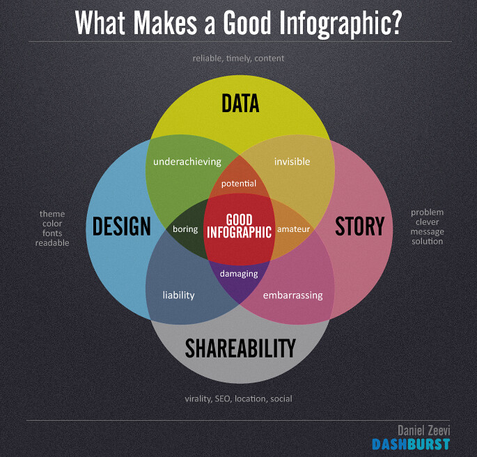
Back in 2016, I identified three key C's in a Baseline article, Data Visualization: You Must 'C' It to Believe It: Context, Correlatin, and Causation. 
Context: This includes contextual information for the graphs, which sometimes indicates that the results visualized represent outliers rather than typical results. Getting the context also requires getting the baseline for the survey, including timelines, locations, and the population size and type used to get the numbers.
As data visualization tools include ways to slice and dice your data, it is not all that difficult to zero in on just the segment that yields the results you want. So you need to know the larger context, as well as any added-in points that are outside that particular context.
Correlation: This is the supposed strongpoint of visualizations: showing up correlations. But they are easily manipulated and misleading, as there are many correlations of time that are not necessarily causally connected—though visualizations can make them appear that they are.
Causation: This is what real insight is all about: finding out what causes what. There is no substitute for thinking this through, no matter how seductive it may be to simply go with the correlations presented by the visualization.
In revisiting an argument offering data visualization as proof, I've come to add some additional C tests:
  • Correspondence to reality. Just because someone claims expertise doesn't mean they are completely correct about their assertions. For example, when I was in labor with my first baby, the doctors and nurses at the hospital just dismissed my pains, claiming the contractions were "mild" and that the birth was far from imminent. I was not the expert; they were, but I knew that I felt the baby coming. As it turned out, the resident barely got to me in time. I learned from that experience that you should not be gaslighted by expert views that directly contradict not what you just think you know but what you do know and directly experience. 
  • Convenience: This pertains to both means and ends. Convenience of means refers to using the data that is on hand or easily measured even if it's not necessarily the data that is the most relevant. It's rather like measuring how much snow fell on your windowsill because it's easy to reach rather than going out to get the measure on the street and in drifts to get a more accurate measurement. Convenience for ends is about selecting data that you can easily fit into the conclusion you wish to draw AKA cherry picking. 
  • Confirmation Bias:In general, when you look for data on something, you have to bear in mind that absolute objectivity is rare. Many of us have deeply-seated values and beliefs that will not allow us to entertain the possibility that we are on the wrong track,which would skew our results because of what we allow and disallow in the data set. It is the equivalent to painting a bull's eye around where your arrow went. So ask yourself, does the person have some personal agenda that could be coloring the outcome? If so you should treat them with the same healthy skepticism you would treat cigarette tobacco studies sponsored by tobacco companies. 
  • Certainty Camouflaging Contingencies: Few things are absolutes, so if someone states something without qualifiers, likely something is being hidden or glossed over -- like the fact that the data is out of date or taking searches of racist terms and jokes as proxies for the person being a racist and then shifting labels from what actually is measured to what the person says is signified by the measurement. This leads to a triple F: Fudging Figures and Facts.

    All of these were inspired by an argument made in Seth Stephens-Davidowitz's book Everybody Lies. Read more about it in Sex, Lies, and Data Profiles

    Tuesday, January 10, 2017

    BI when and where it's needed

    That was a critical factor in adopting WebFOCUS, Thiery says, because so many people rely on their phones more than on their desktop units. Consequently, reports that are not designed to be mobile-friendly are not as useful.
    Generally, the visualizations are reviewed on a weekly basis at leadership meetings. Thiery explains that these meetings are where management "wants to see where we're at and where we're going." The meetings are also where managers make decisions about how many people they would hire.
    As a result of the growth AudioNet has been experiencing, it's been adding on a large number of support people to keep up with the workload. "As our volume increases, so does our revenue," Thiery says.
    The firm also uses WebFOCUS to analyze financial data. That includes revenue dollars, accounts and claims counts that factor into identifying an upward trend.
    - See more at: http://www.baselinemag.com/business-intelligence/getting-business-intelligence-when-where-needed.html#sthash.BMoWyczs.dpuf

    Friday, October 21, 2016

    Data visualization: you have to C it to believe it

     credit https://c1.staticflickr.com/9/8075/8448339735_e6626c28ff_b.jpg
    I wrote this blog a couple of months before everyone started decrying the proliferation of fake news. Notice just about every fake news piece is accompanied by some sort of visualization, whether it is a graph or photo or video. They all capitalize on the "seeing is believing" concept, and one has to be extra vigilant about the lure of visual evidence.

    As a regular big data blogger for several years now, I’ve noticed that in the last couple of years, data visualization has become a major focal point.  The old maxim of “Seeing is believing” is the real driving force behind visualizations of data.  While not all of us relate to spreadsheets, we tend to respond well to graphs, charts, and other visually appealing renderings of those numbers.  

    As Brian Gentile, Senior VP and General Manager, TIBCO Analytics Product Group, TIBCO Software, wrote here there are business benefits to data visualizations.  They include making it easier to take in information, manipulating, data in various ways, and showing relationships.  On the latter, Gentile observes, thatfinding these correlations among the data has never been more important.”

    Indeed, the demand for that kind of instant insight that data visualizations can deliver is what drove Google to build its own data visualization product (currently in beta) called Data Studio. I saw a presentation of the features, including a report on the effectiveness of Olympics ads. It was that particular visualization that made me think of the danger inherent in relying completely on the story presented graphically.

    In that analysis of the effects of ads on consumers, the report stresses that it asked people who saw the ads of particular brands what effect it had on their perception of them. Of course, the graphs are what grab your attention and that show that that 34.9% of viewers recall seeing the Coke ad. The graph does not show what the text admits that overall “only about 8% of viewers can recall both the brand and product in a specific advertisement.” So the graph here implies a much more positive effect for ad recall than the overall data actually shows.

     The next bar graph shows you that “Consumers who saw the ads were 18% more positive about the brand and were 16% more likely to find out more or purchase the product in the ad.” These are fairly modest numbers that don’t necessarily promise much bang for sponsor bucks. So this is followed by a third graph with the title “Which ads showed the greatest response?” That shows really impressive numbers ranging from 112%- 142% for the top 3 brands.


    A mere glance would make you think that these show amazing results for the marketing efforts. Then when you read a bit, you realize that they merely reflect the increase in search.  In other words, the graph does not show that the McDonald’s commercial resulted in an increase of 42% in sales, merely an increase of that amount in online search that includes the brand. Still, you may say that is a positive metric that could possibly translate into improved sales down the road. But the chain of causation here is missing a few links. 
    I got to speak to the Google people about Data Studio and asked if they had even determined if the people who were doing the search were the ones who had seen the ads as was the case for the first two graphical presentations. They had not.  True, it doesn’t say that the graph refers to the people who had seen the ads, but the context would make the viewer think that it does, and not everyone would even think to ask annoying questions like I do.
    Ultimately, what makes data visualization so effective at conveying a point is that they don’t require much analysis on the viewer’s end because they’ve already done that kind of thinking for you. That’s both seductive and potentially misleading.

    That’s exactly why we have to be careful about not merely accepting the visually expressed story at face value. Any data visualization should be subjected to a triple C test
    Read about it here.

    Also check out http://www.clickhole.com/article/greatest-all-time-statistical-portrait-babe-ruth-3983 

    The one on the Babe versus the #12 may be my favorite example of the abuse of data visualization, and I'm not even a sports fan

    Related post: 

    EVERYBODY LIES WITH VISUALIZATIONS

    Thursday, August 25, 2016

    Location, location, location with a dash of analytics

    "Location, location, location.” That’s the mantra of the real estate profession. It sounds simple enough, but the question is what is one looking for to identify a desirable location? Now data analytics can provide a clear answer for at least one type of market: those who seek homes within commuting distance of jobs that provide a living wage.


    Opportunity Score is a data-driven tool built by the real estate company Redfin in partnership with the White House Opportunity Project. It identifies which residential areas offer affordable housing and are within a 30 minute carless commute of jobs that pay at least $40K a year.
    In its blog, Redfin explained what went into powering Opportunity Score....
    Considering a move, or just curious about how your own city ranks? You can plug it in to get the score. Just don’t expect to find a perfect 100. As Redfin explains, a city can start out with the 100 because of the number of jobs that meet the criteria, but then be knocked down due to the home prices. There’s also quite a difference between scores for cities in general and addresses in particular.
    The highest score it assigned to a city is a 70, and that went to San Jose where 78% of jobs meet the criteria. But that’s not the only thing that counts. The same job percentage was found in Detroit, the city with the lowest score -- just 3%. Individual addresses around Detroit, though can reflect very high scores, with, for example, one address on Harrison Street earning the description “Job Seeker's Paradise” with a score of 94.
    Read more in 

    If You Lived Here, You’d Be Home Now

    Tuesday, August 25, 2015

    Mapping the supply chain for greater sustainability

    Like the Rome of old, a more transparent and sustainable supply chain is not built in a day. Building it takes planning, mapping, and fine-tuning. Data visualization enables organizations to bridge all three.
    Awareness of the need for sustainability and transparency in the electronic supply chain is rising. And a number of companies have said they are committed to improving in those areas, whether in response to questions about components of their supply chain, like conflict minerals, or as a positive choice whendefining the company's mission.
    Read more in 

    Mapping Out a Better Electronics Supply Chain

    Tuesday, January 28, 2014

    3D printing brings the stars to the blind

    Discussions of big data often touch on the challenge of visualization. An even greater challenge, though, is rendering the data into something that is comprehensible to people who have to use senses other than sight.

    3D printing brings the stars to the visually impaired by rendering Hubble's images into tactile form.
    Read more in 

    Reaching for the Stars With 3D Printing

    Thursday, August 1, 2013

    Your email organized

    Imagine coming into your office and finding all your files rearranged for better organization. You get a note saying: “You’ll now find your important files here, your social media files here, and your promotions over there.”
    That’s just about what Gmail did with inboxes a few weeks back. While I don’t really mind having my email organized according to the Gmail system, Google's ability to make the change really drove home the point to me that email metadata is open for use.
    Read more in Learning About You From Your Email Metadata.

    Pictured here is an example of the raw metadata sent to me by the Immersion team at MIT.